The campaign
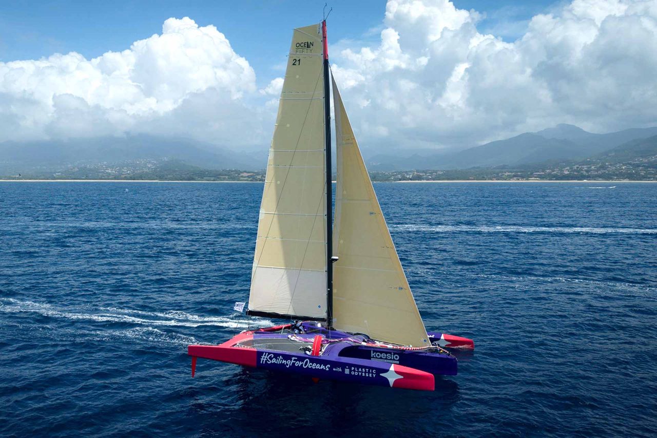
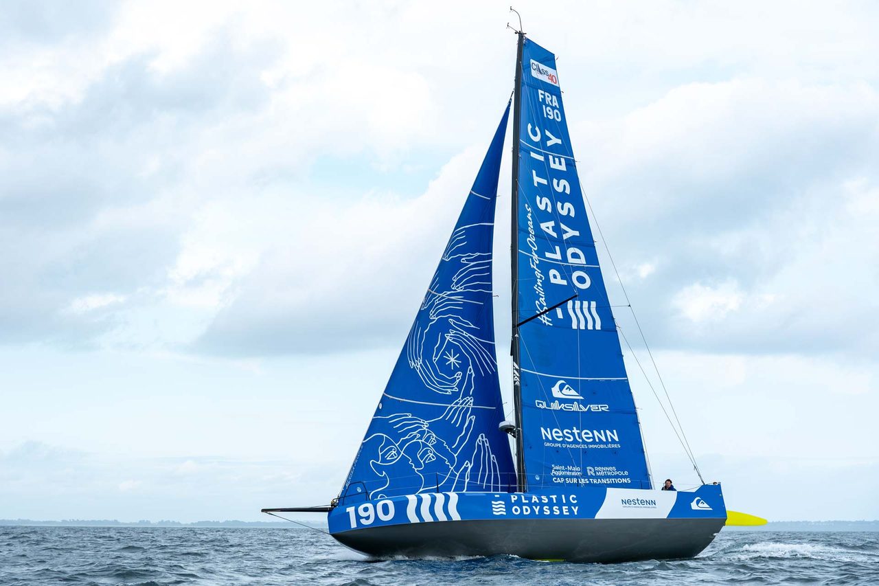
#SailingForOceans brings together a one-of-a-kind racing team around a single cause: restoring the Ocean's marine sanctuaries.
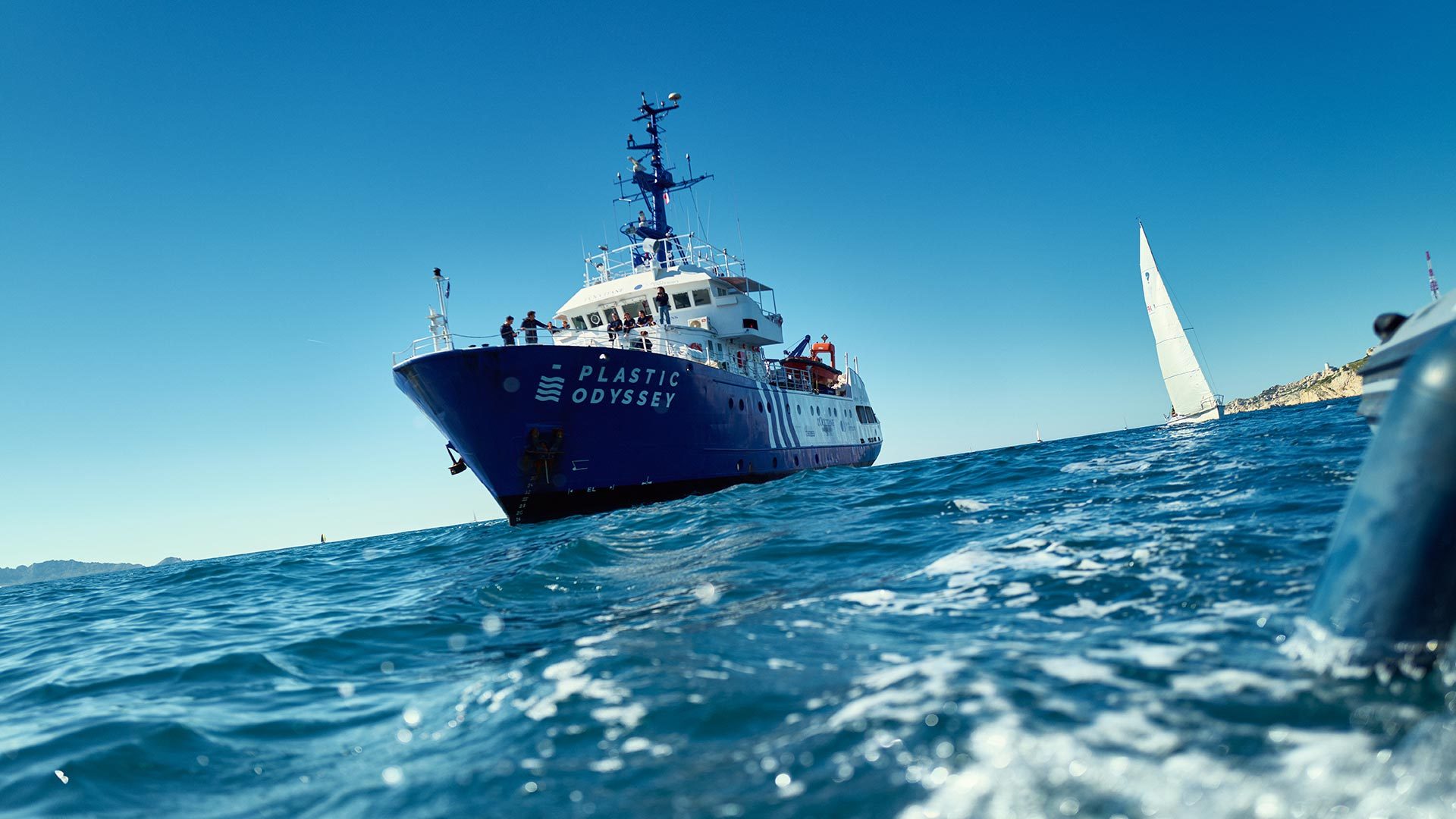
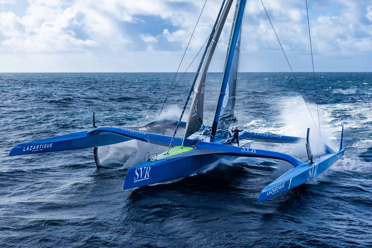
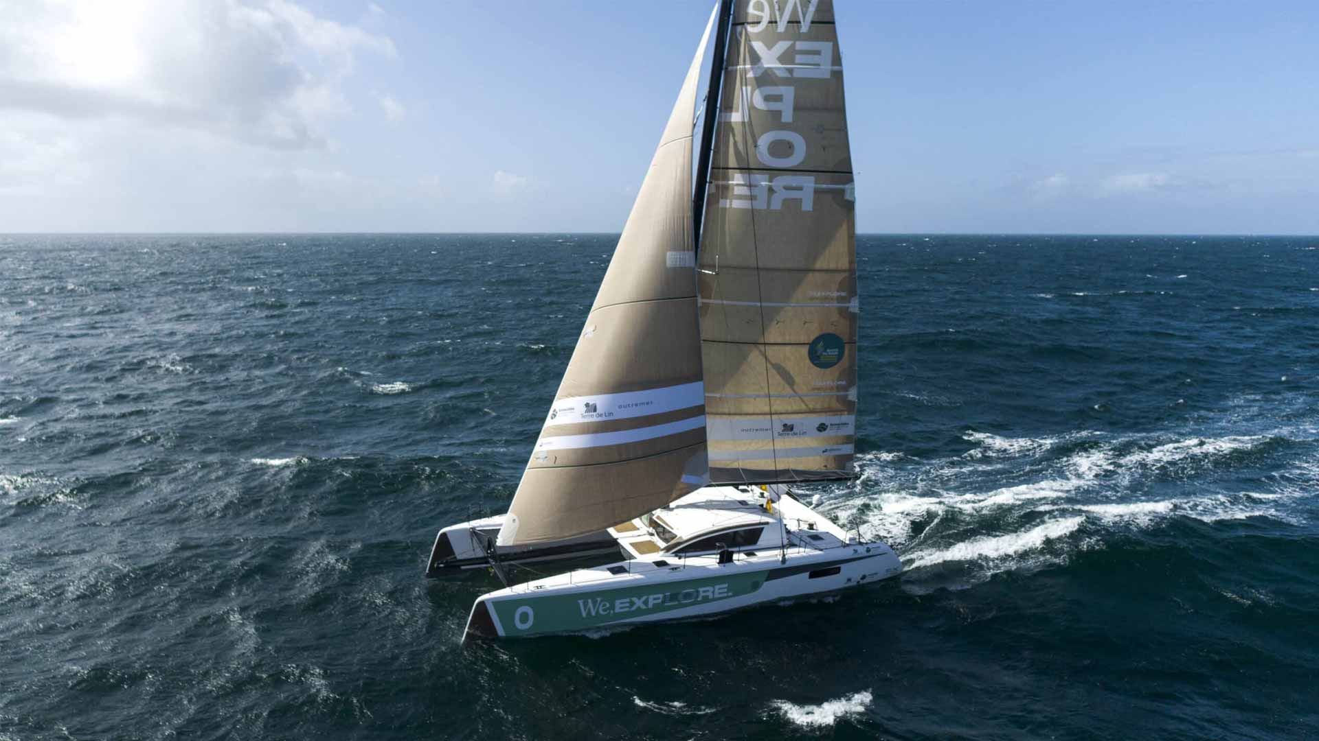
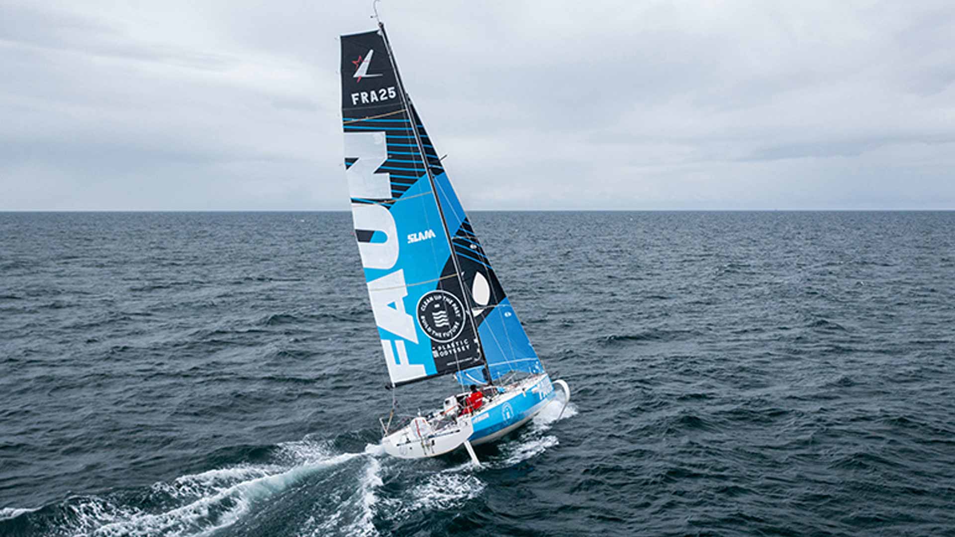
Five skippers who usually race against each other, Tom Laperche, Erwan Le Roux, Jules Bonnier, Roland Jourdain and Adrien Simon, are flying the same colours this time. Around them, every ocean lover can join the crew, with or without a boat: sailors, divers, surfers, sailing clubs, marinas… Every crew member takes action wherever they are, with step-by-step guides, films, exhibitions and kits lent free of charge. The goal: stop the destruction of humanity's marine sanctuaries, the islands and coastal areas that produce part of our oxygen, store carbon, protect our coasts and feed fish. A 60-metre vessel is being built to clean them up, with its first missions in 2029.
This communication kit brings together the campaign's colours, typography, logos and imagery, so that everyone can talk about it with one voice.